All children are artists. The problem is how to remain an artist once he grows up. ~Pablo Picasso
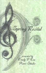 My dear friend Trudy relented to my insistence, the feeding of my creative inner child indulgence, so that I could again design the covers for her spring recital. This year the recital is only for the older children, so my Princess will not be performing in this one, but I still wanted to design the covers, actually to prepare the entire program, but she had someone else already lined up to do the program layout.
This particular one had to have a touch of sophistication as it is a formal recital, however I was hoping to add that feeling of spring. I had different designs in mind, but some did not look as impressive in print as they did as graphics on the computer. Then I found a couple of graphics that just hit me and I immediately knew what I wanted to do with them: layering! The design was easy and took very little time using Paint Shop Pro. I sent the layout for approval. So far, so good.
With the designed approved, the color of the paper had to be decided. Trudy wanted a pastel and I was leaning towards green for spring, because a soft green would blend with the half tones and not look too dull, nor pop in contrast, but everything I saw in the solid color pastels was just too bright for what I had in mind. I found a specialty paper that was just what I wanted. Now the real test would be if Trudy liked it. So, with a number printed and folded, I delivered them to Trudy yesterday just before the Princess' piano lesson. She said she liked the color very much. Now to just fold the inner program and correlate while she taught my daughter.

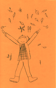 This fever for doing Trudy's programs all started when she asked the Princess to draw a picture for the coffee shop recital last autumn. The coffee shop recital is very casual and artsy. To reflect this, Trudy often asks a student draw something for the cover. We were quite honored that she asked the Princess, because was only seven years old--well, she would correct me here and say "seven and a half."
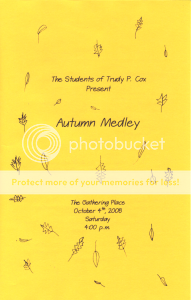 For whatever reason that I cannot remember now, I ended up doing the program as well, which I found to be interesting with all those last minute changes, but certainly enjoyable! The Princess decided to draw a boy throwing leaves because it was autumn, although the leaves had not yet begun to fall and it was rather warm yet. After I did the layout for the program, I decided that the theme from the cover could be carried on into the program itself and so I asked the Princess to draw leaves throughout the entire thing.
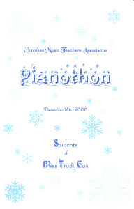 The Pianothon is also a dressy event, but it takes place in a mall at the first part of December when most people are doing their Christmas shopping. Although it is in a less busy area of the mall, it is noisy with people walking by and other distractions.
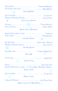 Christmas music ranged from reverent religious to cute children's songs, so I thought the program would do well with a clean look and just a bit if whimsy. This time I was to do both the cover and program layout, I thought of blue snowflakes on white throughout the program with a very stylish font. Each page was designed so that the snowflakes did not interfere with the information.
Each one has been a joy to do!
My Lord, You are the Ultimate Artist. We could not have music or art if you have not created it first. Thank you for my daughter's talents and for the opportunity to use what You have given to me.~